

‘A beautiful object’
In his 2011 Man Booker acceptance speech, Julian Barnes was quick to praise the unsung hero in the publication process, his book cover designer, Suzanne Dean. But this was three years ago, and Barnes’s concern was the rise of the e-book which, as we all know, is no threat to the paperback. It is just another way that we deliver our writing to readers. Good design needs to take account of all the formats a book may be produced in.
For authors whose writing blurs genres, as mine does, book cover design is a vital part of branding. I dismissed free ready-made options immediately. Working with a limited marketing budget, this is one area I refused to compromise on. For less than £100, and with a little imagination, it is possible to create something unique. The thing that will make a potential reader stop and look twice.
How to create a ‘brand’ look?
For me, choice was narrowed because I wasn’t starting from scratch. The cover Transworld produced for Half-truths and White Lies was my template. If this is your first book, however, start thinking long-term.
My thoughts on branding were simple: I wanted the books to look like a set, something people would want to collect. This meant choosing strong images, using the same fonts and repeating the cover image on the spine.
The cover designer
My choice of cover designer was a happy accident. I already knew Andrew Candy. He owns Mine Art Gallery, which forms a central part of our local arts community in Carshalton. It is important to me to support local businesses. I knew that, as an artist, Andrew had a good eye. It was only when I got chatting to him one day that I discovered that he was also a graphic designer, and the conversation turned to book covers. Yes, he had experience and, yes, he wanted to get involved.
Firstly, it is only fair to mention that I gave Andrew very limited time for the first two cover designs. Having decided to self-publish in November, I had a mad idea of issuing a double-release on Christmas Day. No sane person would put themselves under this amount of pressure, but I had read that one of the biggest days of the year for e-book downloads is Christmas Day – immediately after people unwrap their new Kindles.
I am a very visual person and I have a passion for photography so I wanted to be a part of the design process, sourcing the photographs and coming up with the concepts. One of the advantages in using a local firm is that issues can be ironed out face to face. You may prefer a more arm’s length approach, effectively handing the whole process over to a cover designer, in which case you will need to prepare a very specific brief. (see below and notes at end.)
Sourcing Stock Images
There are many excellent stock image libraries on line. I use Dreamstime because, compared with similar suppliers, their pricing is very reasonable (budget £15 per image) and their licences aren’t restrictive. They operate a system whereby each image costs a certain number of credits. ‘Royalty-free’ doesn’t generally mean that there is no cost attached, it simply means that the photographer doesn’t receive a royalty. Your choice of site may provide a limited number of free images, but you would be lucky to find one that encapsulates your book.
When looking for inspiration, if I don’t have a design concept already in mind, I enter the key themes from my novels in the site’s search engine. Dreamstime has a ‘light-box’ facility where you can store photos while you narrow down your choices. It is possible to download samples with a ‘watermark’ on them, so that you can share them with your designer and discuss which ones will work best. Before you purchase, check which size you need (I always opt for extra large). There is also an option to extend the licence, depending on how you wish to use the image.
The choice of images
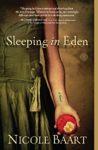
Looking for a single image that captures both the themes of a book and its genre is not always easy. These Fragile Things tackles some meaty subjects, including near-death experience and religious visions. I was only aware of one other contemporary novel covering the same issues – Francesca Kay’s The Translation of the Bones, whose cover makes a confident statement about the content – a woman holding a rosary. Instead, I opted to convey the mood of the book. A butterfly with a broken wing is an emotive image, conveying fragility.

Of course, the butterfly was also a recurring motif in the book. This short extract is when Judy challenges her father Graham after learning about her prognosis.
“Stop trying to be nice! I saw the doctor telling you I’m not going to walk again!”
His slow nod confirmed what, so far, no one had had the guts to say.
“When were you and Mum going to tell me, exactly?” she demanded.
“We weren’t trying to hide anything. We wanted to get you away from that sort of negative attitude. Now” – he locked eyes with her – “you’re going to prove them wrong.”
Judy turned away from his certainty to face the wall.
“I mean it, Judy. Think of your plaster cast as a chrysalis. Every day you’re getting stronger. Soon, it will be time for the butterfly to emerge.”
For I Stopped Time, my photography-themed historical novel, I also chose a single image, something that tied together two of the book’s elements: time itself, in the form of an antique fob watch, and a photograph of a motor cycle.

These cover designs cost just £50 each and I am often complimented on them. In fact, I was chuffed to bits when I met Joanna Penn and she said that she recognised the cover for These Fragile Things. This means that it is memorable!
The brief
Even if you are happy to be in the driving seat, your instructions to your designer still need to be very specific. Remember to include:
- the book’s dimensions, both size and spine width, which you will need to calculate based on the page count and the paper you have chosen (your publisher may supply a template, in which case your designer will need to work within this).
- your author name, exactly as you wish it to appear.
- The book’s title.
- any tag lines.
- testimonial/s.
- clear advice as to where the bar code will appear – you don’t want your designer to produce a beautiful back cover, only to find that part of it is obscured!
- any specific requirements your chosen publisher/s may have (in the case of e-books, the format and size in which the final version needs to be uploaded).
Growing trust
Of course, once you have learned to trust your designer’s instincts – and provided you give him more than a couple of days to come up with the goods – limitations seem to disappear.
My next release, A Funeral for an Owl, deals with the issue of missing persons. I had found what I had thought was the perfect image on-line and had tracked down the photographer via Google Images. It appeared on several photographers’ websites but it was not theirs and, no, they hadn’t researched who owned the copyright. It turned out that the photographer was Turkish interior design student, Yunus Emre Uzun. He very kindly gave me permission to use the image with no charge and no limitations. I think you’ll agree it is stunning.

Unfortunately the resolution was very poor. So, after all my research, I had to start again from scratch. I wasn’t thinking straight. In my mind, I was still looking for the one perfect image. And then, one morning at 3:00am, I remembered the cover for Glasshopper by Isabel Ashdown, which combined several images. I could do this!

Normally, I prefer to avoid giving my characters a face – this is best left to the readers’ imaginations – but I also remembered what a strong image a boy can be.

Cover artwork from Boy by U2

And, of course, Billy from Kes…
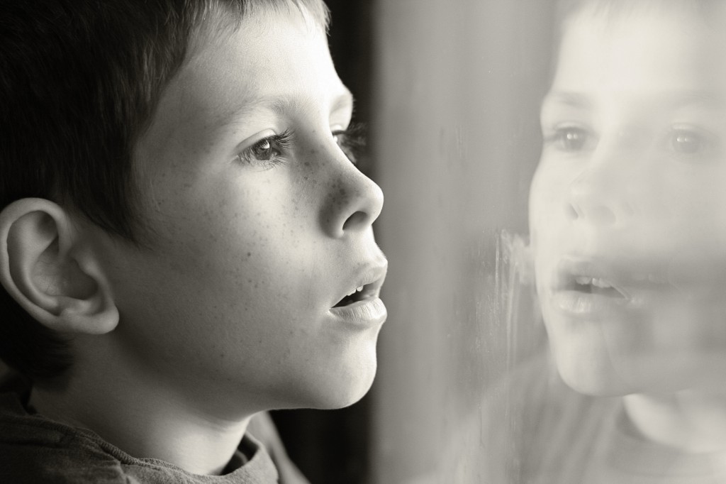
When I was initially looking for images for young Jim, I wanted a boy with a pair of binoculars, but that would have obscured his face. What I found was far more powerful. A boy looking out of a window, his face reflected back at him. The wonder in his eyes is palpable. A boy who might be looking out of the window of his council flat and catching his first glimpse of an owl…
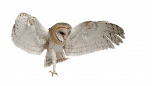
There was an overwhelming choice of images of barn owls, but I was looking for an owl with ‘angel’s wings’. (Most photo libraries have such a large stock of images that they rotate them, so it’s worth logging out and logging back in again.)
Shamayal pointed to the empty shelf space, then paused in front of the large framed photograph over the fireplace. “I bin meanin’ to aks about that. When I woke up it was starin’ right at me. It’s some kinda owl, right?”
“A barn owl.” Aimee’s owl, to be specific, because that is how Jim thought of it. Looking at the photograph afresh, he was still struck by the image: the bird’s talons extended, its whole body taut as it lands on a slim post.
“Right, right. The wings, all spread out and that?” The boy mused. “They’re kind of like an angel’s.”
Funny kind of angel. If that’s what she was. “In some cultures, people think they become owls after they die. That would make them ghosts.”
“Ghosts? Yeah, I get that.”
It was easier to source images of railway tracks.

I gave Andrew a very specific set of instructions, but what he produced surprised me. I had imagined that the text would need to be brightly coloured and had given him some suggestions. I had also imagined that my small owl would dance along the top of the titles. I explained that I was not at all afraid of white space. Instead, this is what he came up with.

And now it’s difficult to imagine the book with a different cover.
And so I got braver. I had two ideas for An Unchoreographed Life. The first was a vintage image of an old-fashioned globe, which had a rim around it, as old-fashioned globes do. I would use the rim as a road and on it would be placed, among other things, a London bus, a ballerina and a pelican. But, as designs go, it was busy. Too busy for the small scale of an e-book cover.
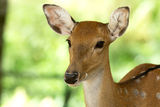
My second idea got the nod of approval. Could Andrew put the head of a deer on a ballerina? Yes, but I needed the angle and the widths of the necks to be the same. Game on.


Three images, combined to make this…

Coming soon…
On one occasion she had encountered a stag, misty-breathed as it crossed the path directly in front of her, turning its noble head, looking her boldly in the eye. And she met his challenge fearlessly, standing her ground on the muddy tract that cut through the russet ferns, then edging slowly towards him. Every muscle alert, he feigned disinterest. By now Alison had learned how to move while giving the appearance of stillness. In another life she might have been a skilled stalker. At any moment he could have charged towards her or bolted, but they contemplated each other – she and the stag – and to Alison it was as if she were looking in a mirror. His head held high, showing his pride. Something of her own humanity reflected back at her from a face that was clearly animal. She had a sense that they shared some ancient understanding. Even at that moment, Alison had known it would prove impossible to explain her learned wisdom, and so she kept it to herself. Used it, as she used everything, to add another dimension to her dance.
With an average of two seconds to grab someone’s attention on line, the image needed to stand out against the competition. I’m absolutely delighted with it.
A quick round up
Do: spend time researching current trends in your genre of fiction. Browse the tables at the front of bookshops or the shelves of supermarkets and ask yourself what the covers tell you about the books. Then check to see if you were right. If your genre is crime, look at the covers of the top 10 crime novels. List the key components.
Do: consider your readers’ likes and dislikes rather than your own taste. If you are writing for an age-group other than your own, such as children’s fiction or young adult, you may wish to carry out research with your target market as to the covers that they find appealing.
Do: ask to see examples of the cover designer’s previous work. Double-check that he/she understands key issues such how e-books are leading the way in cover design and the readership you want to appeal to.
Do: opt for matte finish for fiction, if offered by your chosen publisher.
Do: check every element of the design carefully. Images may draw your eye away from typos. If necessary, write yourself a checklist. It may seem obvious, but don’t overlook the spine! Remember that your designer may charge to make changes as a later date.
Do: remember to credit the cover designer, the photographer and the photo library in the book’s front matter. This may be a contractual requirement but, even if it isn’t, it’s only polite.
Do: check the limitations of any licence you are buying for use of stock photographs. These may be based on intended use, the number of uses, or there may be an expiry date.
Do: combine images to create something unique. You know how it feels when your turn up at a party wearing the same dress as someone else?
Look familiar?
Do: have fun with this. Deciding how to present your work is one of the joys of self-publishing.
You can contact Andrew Candy at design@tentacleltd.co.uk
Further reading – how others do it
Joanna Penn of The Creative Penn talks to designer Jane Dixon Smith (This will be of interest to those also looking for an insight on interior design elements)
Visit Jane’s website here
Here, Joanna Penn shares why she chose to change her book cover from her choice of image to one that matched her readers’ expectations.
Roz Morris explains why getting reader feedback is so important in a piece called My Nearly Disastrous Cover, and then reveals her final choice of cover. (Open the door!)
If you enjoyed this post, visit the sidebar and subscribe to my blog
Want to be featured?