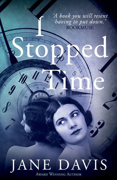
Cover design is an unappreciated artform and yet it is also an author’s first – and possibly their most important – promotional tool.
In his touchingly modest Booker acceptance speach, Julian Barnes went to great lengths to praise his cover designer, Susanne Dean, for turning A Sense of an Ending into ‘a beautiful object.’ Something that people would want to own.
That was in 2011. Book cover design is changing. In a fast-evolving market, the majority of purchases (50% of which are eBooks) are already made on-line and, if current trends continue, will soon be made on apps via tablets and mobile devices. What was once a three-dimensional design is now reduced to two, giving rise to the headline at Frankfurt, “The Spine is Dead.”

The cover of a book, a single image reduced to a ‘thumbnail’, is tasked with performing a multitude of jobs.
- In a market where less than 1% of books receive media coverage, it will probably be the novel’s only advert.
- It should speak to the market.
- It should identify the genre.
- It should deliver a clear message.
There is a problem with original cover design. If a cover succeeds – if it sells a book in volume – it will spark a trend and every marketing guru will want a piece of the action.
No wonder, then, that being presented with an impossible-to-relate-to book cover is one of the most frequently-heard complaints from traditionally published authors – and women writers in particular. The marketing department has not understood where they are coming from, as a result they find they have been pigeon-holed, and there is every chance that there will be repercussions for the author’s long-term career.
Conversely, participating in the cover design process can be extremely satisfying for indie authors – the only fear being that, if you get it wrong, you only have yourself to blame.
Speaking at the Writers’ & Artsists conference on Self-publishing in a Digital Age Conference last week, author Tracy Bloom described her approach when commissioning a cover for her funny romantic novel, No-one ever has Sex on a Tuesday. (Well, very rarely. She has the research results to prove it.) She wrote a very specific brief. Whilst the general consensus is each book should resemble others in the same genre, Tracy deliberately went the other way. Knowing she had a killer title, she wanted it to ‘stand out and demand attention.’ There was to be no silhouette of an unfeasably skinny woman walking into a sunset and under no circumstances were there to be any fluffy kittens. The look was to be simple: clean and contemporary. There is pink, but the pink is not what grabs you. The ‘sex’ is what grabs you. 1617 reviewers agreed.

If you are commissioning your own cover, it is vital to find a designer who understands you. I work with Andrew Candy.
As I write cross-genre fiction, my original brief to Andrew was that we established a ‘brand’ that drew on elements from the Black Swan’s cover for Half-truths and White Lies (including its spine) and gave the appearance of a collectable set. For my new novel, A Funeral for an Owl (out on 1st December), I set Andrew more of a challenge by presenting him with a number of images that I wanted him to combine to form a cohesive whole that told a story.
Frankly, I can’t stop looking at it.
For more great content, subscribe to Jane’s blog (see sidebar and insert your email address)


