

I’m very proud to have one of my titles included in author Jill Marsh’s top 10 examples of beautiful cover designs. These are the covers that make her want to look inside the book (and I’m in great company).
“Elegant, intriguing and atmospheric. The image evokes thoughts of Shakespeare and the Penguin Café Orchestra. The shades of blue, as if the figure were subtly spotlit, the choice of delicate motifs such as rose stems, deer and ballet combine to lure you in, convinced the story must be equally beautiful.”
Jill’s article was her reaction to a recent article published by book promotion site, Bookbub, about eight cover design trends that sell more books. If my brand fits into any of Bookbub’s eight categories, it is Great Photography (although I would add ‘with a twist’.) The article provoked an outpouring of views, both positive and negative. ‘These guys really know what they’re talking about’ some said. Many readers held up their hands in horror: ‘They all look amateurish.’
When competition to win readers over has never been so fierce, some writers may have asked themselves, ‘How well is my cover working for me?’ But writers shouldn’t be keen to win readers at any cost. Covers are marketing tools, but they also represent a contract, giving a clear indication of genre and style. Get it wrong, and you risk attracting (and then alienating) the wrong reader. I concluded that I wasn’t the right reader for any of the books that Bookbub featured – and that’s fine. They were clearly not the right books for me. In that sense, they did their jobs extremely well. On the other hand, I love all of Jill’s choices. These are covers that may lead me to discover a new favourite author. In other words, they make me feel genuinely excited.
On the release of An Unchoreographed Life, Dan Holloway asked me about my book covers and branding.
Let me start with your covers – how important is it for you to maintain such a recognisable feel to your books? If you could summarise that feel, what would you say?
Here’s how I replied:

Branding is hugely important to me. The brief I gave my graphic designer was that my books should look like a set you’d want to collect. I was thinking of my own bookshelves: the novels of John Irving; Frank Herbert’s Dune series; the classic Penguin paperbacks. I wanted that certain something that would make people pick it up and say, ‘Oh, another Jane Davis!’ I didn’t start from scratch. Instead, I borrowed elements from the cover of Half-truths and White Lies and used them as building blocks: the font and the strong photographic image, repeated on the spine.
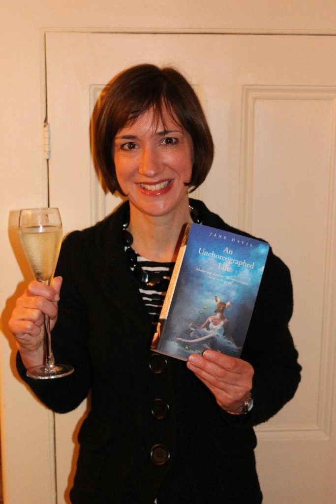
In terms of the feel, I try to reflect the themes and emotions of individual novels. The cover for A Funeral for an Owl, which features a boy and an owl, is the most literal. I am absolutely clear in my approach about what I don’t want. My novel, These Fragile Things, tackles near-death experience and religious visions. I didn’t want to exclude readers who wouldn’t normally read Christian fiction, because that’s only one element of the book. I chose a butterfly with a broken wing, which represents transformation and hints at vulnerability. For An Unchoreographed Life, my story of a ballerina who turns to prostitution, I was careful to avoid any hint of erotica. Instead I wanted to give the feel of a woman living behind a mask; someone who has not quite left her past behind. That’s how I arrived at the image of a ballerina with a deer’s head.
For me, the key elements of cover design have to be: instantly identifiable, inclusive and – I hope – intriguing.
Press

Want to be featured?

Host a bookclub
Latest books


")


Read an excerpt