An encounter with the serpent
Why I'm changing the cover for I Stopped Time - again!
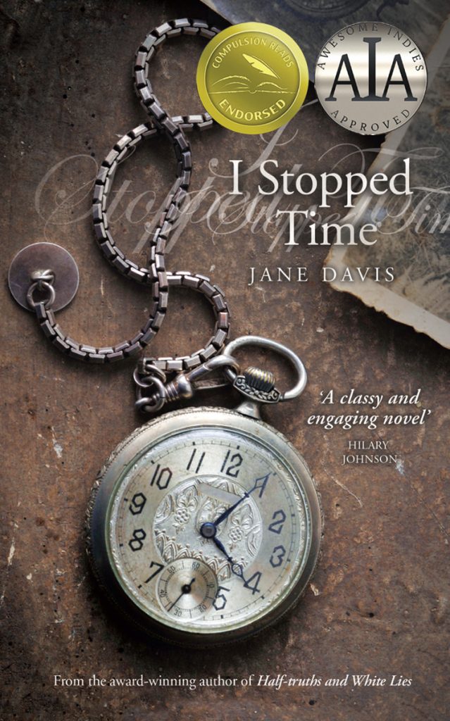
When I released I Stopped Time, it was to test the waters. And by ‘the waters’, I mean what was then the brave new world of self-publishing. I commissioned a cover design, choosing a photograph that was appropriate to the era and included the themes of time and photography. The result was in keeping with covers at the time, but covers date. This one was very brown, and brown does not sell terribly well when reduced to the size of a thumbnail.
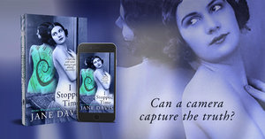
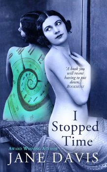
In 2015, before publishing new book shop editions, I decided it was time for a new cover, telling designer Jessica Bell I needed something that stood out from the crowd. The vintage nude design was one of four concepts that she mocked up. It was the perfect fit for one of the excerpts I’d sent her.
The Nudes (excerpt from I Stopped Time)
When I heard her intake of breath, loud above the ticking of the clock, I knew that Jenny had reached what I had dubbed ‘The Nudes’. I have always found Kenneth Clark’s distinction between being naked and nude useful: to be naked is to be deprived of clothing, implying the embarrassment we feel in that condition, whereas to be nude has no uncomfortable overtone. In reality, the women in the photographs weren’t nude. Like Rokeby Venus, they were positioned, draped and lit, so that only so much was revealed – not at all daring by today’s standards. But, in the context of the other folders’ contents, unexpected to say the least.
“I hope you’re not trying to shock me, Sir James,” Jenny quipped, the urge to say something outweighing the wonder of what she held in her hands. Her failure to put the prints down on the table betrayed a refusal to be parted from them.
“I don’t find them shocking.” I wasn’t worried that she would question my motives. Anyone who listened to local gossip – and, in a village the size of Shere, that meant everyone – would know I’ve never been interested in young girls.
She laid a couple of the photographs side by side on the table. “Have you noticed? There’s no underwear in sight. Not a single suspender. No stilettos.” Jenny had detected what I hadn’t been able to pinpoint. In classical art, the nude is intended to show the perfection of the human form. With photography, results are instant, rarely considered to be that finer thing we call ‘art’. “There’s something” – she shook her head – “innocent about them.”
“Precisely!” I was delighted she had grasped it immediately. “Like Eve before her encounter with the serpent.”
Empowerment, not objectification
Believe me, if I’d thought my cover objectified women, I wouldn’t have put it on one of my books. The gulf between artistic nudes and pornography is so wide, I shouldn’t have to defend my position – it’s blatantly obvious. For the fictional women who found their way to the doors of Lottie Pye’s photographic studio, being photographed in the nude was an empowering experience. Perhaps in the way that women have photographs taken in the late stages of pregnancy. Remember the Demi Moore shot? https://babyology.com.au/pregnancy/stages-of-pregnancy/the-story-behind-that-famous-demi-moore-pregnancy-shoot/
But this is a distinction apparently too subtle for faceless organisations are unable to grasp. Firstly Amazon advised that I could no longer advertise I Stopped Time on their website. I fought them on this, contesting that my vintage nude was not in a sexually provocative position. I sent them some of the photographs that had inspired the novel – Man Ray’s Kiki and his photographs of Lee Miller. Referencing the use of the female nude in religious art (the Vatican Museum houses one of the finest collections of nude figures in the world), I argued that a nude could not be considered to be pornographic per se. Initially they only took down my best performing ad, but gradually, one by one, the others disappeared. I stuck to my guns. The cover stayed. Now it has come to the attention of Facebook’s censors. Apparently, it contravenes their policy for Sexually Positioned Products: ‘Listings may not position products or services in a sexually suggestive manner.’ They have told me I can appeal their decision, but I’ve spent an hour trapped in a spiderweb of electronic links and I’m damned if I can find their appeal form.
I guarantee you’ll never think of button holes in the same way again
Ignoring the dearth of book covers featuring greased male torsos (which Amazon has no trouble with), some of the most risqué book covers don’t feature nudes. As this feature shows, given the right context, a single button hole can be far more provocative.
But button holes slip past censors, because all social media sites care about is the percentage of the book cover taken up by skin. Personally, it was the woman’s eyes that drew me in. There was something familiar about them.
And so it is back to the drawing board. But I begrudge this. I really do.
To have future posts delivered directly to your in-box, visit the sidebar on the right and subscribe to my blog, or to find out about new releases, competitions and freebies, subscribe to my newsletter and I will send you a free copy of my novel, I Stopped Time, as a thank you.
While I have your attention, can I please draw your attention to my updated Privacy Policy. (You may have noticed, they’re all the rage.) I hope this will reassure you that I take your privacy seriously.
Remember, if you enjoyed this post please share it.
If you have subscribed to my blog but no longer wish to receive these posts, simply reply with the subject-line ‘UNSUBSCRIBE’ and I will delete you from my list.


